In this tutorial we’ll be dealing with some basic HTML5 additions and their uses. We’ll also be creating a simple animated gallery using just CSS3 and HTML5
In making the gallery, we’ll also try and deal with responsiveness and scaling the gallery for different resolutions and devices.
Throughout this tutorial JavaScript will not be used!
Step 1: Understanding the HTML5 additions
There are lots of new tags in HTML5; today we’ll be dealing with the some of the most common ones.
- section
- article
- header and hgroup
- footer
- nav
- figure and figcaption
It should also be noted that DOCTYPE has been simplified, now there is only:
<!DOCTYPE HTML>The two most commonly confused tags are section and article. Put simply a section enables you to group logic items together, in this case articles. The confusion arises because an article can also have sections. An example of this would be a news site. The news site has several sections like current affairs, political and science. Each of these sections provides an overall grouping of the news articles inside. Something like this:
<section id=”current-affairs”>
    <article id=”news-item-1”>
    </article>
    <article id=”news-item-2”>
    </article>
</section>
<section id=”science”>
    <article id=”news-item-3”>
    </article>
    <article id=”news-item-4”>
    </article>
</section>
As I mentioned above, articles can have sections too. Think of these as an introduction, main text and a conclusion, like this:
<section id=”current-affairs”>
    <article id=”news-item-1”>
        <section class=”introduction”>
            <p>This is the introduction</p>
        </section>
        <section class=”body”>
            <p>This is the body of the news item</p>
        </section>
        <section class=”conclusion”>
        <p>This is the conclusion</p>
        </section>
    </article>
</section>
HTML5 goes further with this logical break down of site content. With the introduction of the header and footer tags, we can now clearly define those elements common to every website. The top and bottom of a page are not the only places that you can use these elements. You can also use them in sections and articles. A simple news item may look something like this.
<section id=”current-affairs”>
    <article id=”news-item-1”>
            <header><h1>News Story</h1></header>
            <p>This is the introduction</p>
            <footer>Published on 24th of May 2013</footer>
    </article>
</section>
It’s quite common to have 2 headings together e.g. a main title and a subtitle. You can now group these using the hgroup tag.
<section id=”current-affairs”>
    <article id=”news-item-1”>
        <header>
            <hgroup>
                <h1>News Story</h1>
                <h2>News by line</h2>
            </hgroup>
        </header>
        <p>This is some text</p>
        <footer>Published on 24th of May 2013</footer>
    </article>
</section>
The figure and figcaption tags are also new to HTML5; they are used for wrapping self-contained images. The figcaption can be placed at either the top or bottom of the figure tag.
<figure>
    <img src="images/random.png" alt="Random image" />
    <figcaption>
        Copyright information or attribution
    </figcaption>
</figure>
Hopefully you’ve now got a basic understanding of some of these new tags.
Step 2: CSS3
http://www.w3.org/TR/CSS/#css3
http://www.w3.org/TR/css3-transitions/
http://www.w3.org/TR/css3-transforms/
CSS3 introduces lots of new styling techniques, particularly in the area of animation. This is where we’ll be concentrating on. These new additions come under the property name of ‘transition’. Unfortunately due to the various browsers implementing the standard at different speeds we have to make some allowances as not all browsers support the transition property. For the most part, we can get around this by prepending browser specific extensions. This means we have to duplicate our CSS properties 4 times.
transition /* W3C */
-webkit-transition /* Safari & Chrome */
-moz-transition /* Firefox */
-ms-transition /* Internet Explorer */
-o-transition /* Opera */
The definition of a transition can range from being quiet simple to complex. It all depends on what you are trying to achieve.
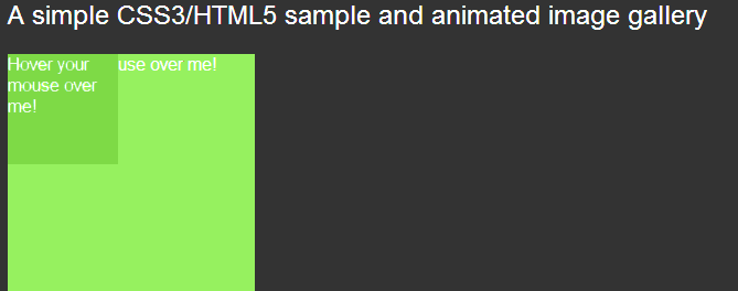
A simple example of a transition is animating a change to an elements size. We first define the property that that we want to transition, in this case ‘all’.
We then then define the timing method, here we use ‘ease-in-out’. We could have used any of the following:
- ease
- linear
- ease-in
- ease-out
- ease-in-out
- cubic-bezier (This allows you to define your own function)
The final part is the delay; here we wait 1 second before starting the transition.
Let’s do a quick example to see how it works.
CSS
div.resize-transition {
    background-color: #96f15f;
    width: 100px;
    height: 100px;
    transition: all 1s ease-in-out 1s;
    -webkit-transition: all 1s ease-in-out 1s;
    -moz-transition: all 1s ease-in-out 1s;
    -ms-transition: all 1s ease-in-out 1s;
    -o-transition: all 1s ease-in-out 1s;
}

div.resize-transition:hover {
    width: 300px;
    height: 300px;
}
HTML
<div class="resize-transition">Hover your mouse over me!</div>Now, when we hover over the div, it will automatically resize to 300px*300px over 1 second. You can use this method to do all sorts of animations such as rotating or scaling.
Now that we have the basics out of the way, lets put it all together.
Step 3: Putting it together
Here’s a template page for you to start off with.
<!DOCTYPE html>
<html lang="en">
<head>
<meta http-equiv="content-type" content="text/html; charset=utf-8">
<title>Tutorial 1</title>
<link rel="stylesheet" type="text/css" href="style.css">
</head>
<body>
<div id="page">
<!-- [banner] -->
<header id="banner">
<hgroup>
<h1>Tutorial 1</h1>
<h2>A simple CSS3/HTML5 sample and animated image gallery</h2>
</hgroup>
</header>
<!-- [/banner] -->
<!-- [content] -->
<section id="content">
</section>
<!-- [/content] -->
<!-- [footer] -->
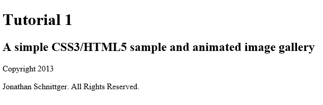
<footer id=”footer”>
<details>
<summary>Copyright 2013</summary>
<p>Jonathan Schnittger. All Rights Reserved.</p>
</details>
</footer>
<!-- [/footer] -->
</div>
<!-- [/page] -->
</body>
</html>Here you can see the basic layout of a HTML5 page; we’ll be building up the CSS and the rest of the HTML as we go.
First, let’s add our main article. We’ll put this in the content section.
<section id="content">
<!-- [ gallery] -->
<article id="gallery">
<header>
<h2>Gallery</h2>
</header>
<section id="css3-gallery">
</section>
<nav id="images">
</nav>
</article>
<!-- [/ gallery] -->
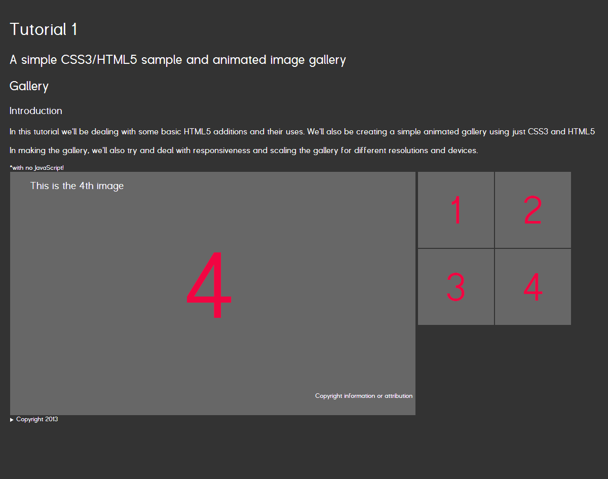
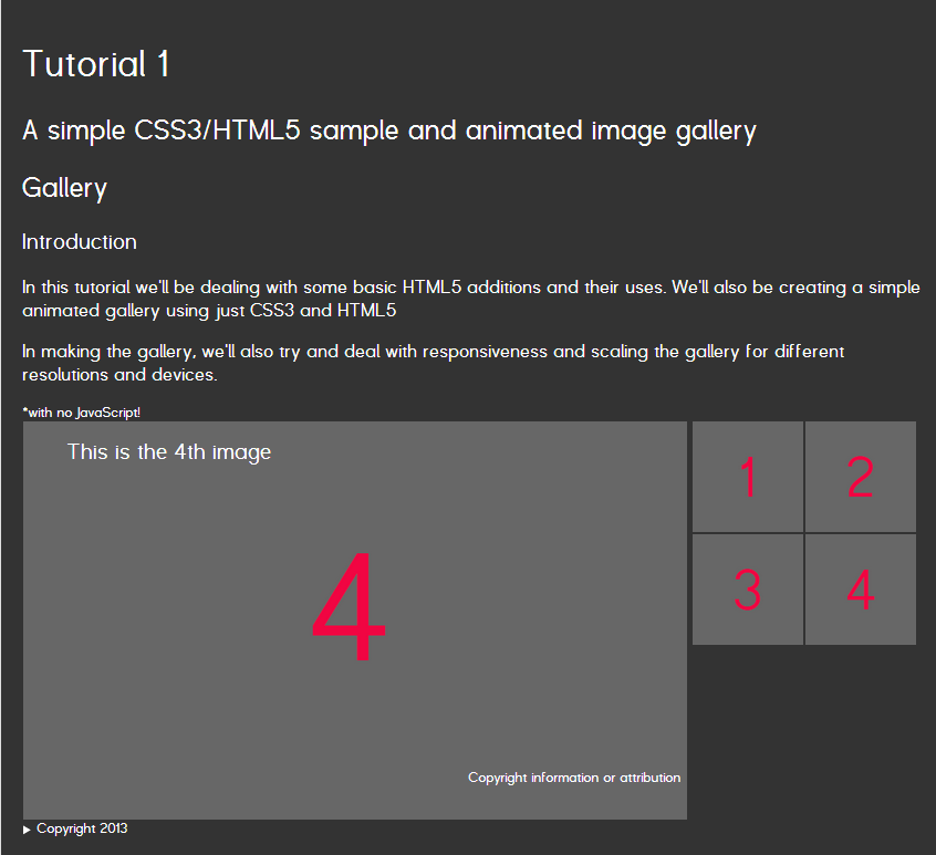
</section>As you can see I’ve broken the article down in to different elements. We have our header with the title, a section the gallery itself and a nav element for browsing the gallery.
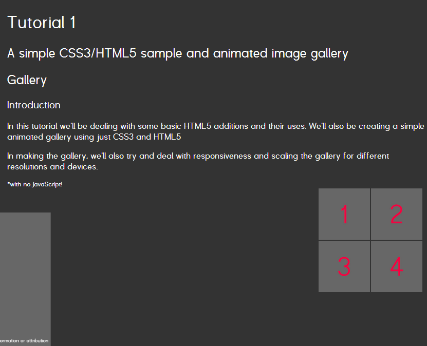
The first part of the gallery we’re going to create is the thumbnail preview or navigation. In the nav, we’re going to place a list of thumbnail images. Each thumbnail will have a hyperlink that specifies just the id of the image we’re looking for.
<nav id="images">
    <ol>
        <li><a href="#image-1"><img src="images/1-small.png" alt="1st image" /></a></li>
        <li><a href="#image-2"><img src="images/2-small.png" alt="2nd image" /></a></li>
        <li><a href="#image-3"><img src="images/3-small.png" alt="3rd image" /></a></li>
        <li><a href="#image-4"><img src="images/4-small.png" alt="4th image" /></a></li>
    </ol>
</nav>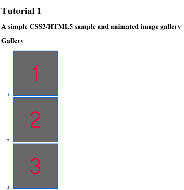
The reason for doing this first, even though it is after the gallery section will be apparent later on.
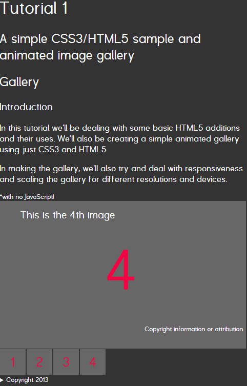
Next we have to create gallery for the full sized images. Again we add a list of the full sized images, but this time we’re also going to include header and footer tags.
<section id="css3-gallery">
    <ol>
        <li id="image-1">
            <figure>
                 <header>
                     <h3>This is the 1st image</h3>
                 </header>
                 <img src="images/1-large.png" alt="1st image" />
                 <figcaption>
                     Copyright information or attribution
                 </figcaption>
            </figure>
        </li>
        <li id="image-2">
            <figure>
                 <header>
                     <h3>This is the 2nd image</h3>
                 </header>
                 <img src="images/2-large.png" alt="2nd image" />
                 <figcaption>
                     Copyright information or attribution
                 </figcaption>
            </figure>
        </li>
        <li id="image-3">
            <figure>
                 <header>
                     <h3>This is the 3rd image</h3>
                 </header>
                 <img src="images/3-large.png" alt="3rd image" />
                 <figcaption>
                     Copyright information or attribution
                 </figcaption>
          </figure>
        </li>
        <li id="image-4">
            <figure>
                  <header>
                     <h3>This is the 4th image</h3>
                 </header>
                 <img src="images/4-large.png" alt="4th image" />
                 <figcaption>
                     Copyright information or attribution
                 </figcaption>
          </figure>
        </li>
    </ol>
</section>
Now that we have the HTML completed, let’s start styling it. Here’s the start of the CSS
body {
    background-color: #333333;
    font-family: Helvetica, Arial, sans-serif;
    font-smooth: always;
    -webkit-font-smoothing: antialiased;
    color: #ffffff;
    padding: 0px;
    margin: 0px;
}

h1, h2, h3, h4, h1 a, h2 a, h3 a, h4 a {
    font-weight: 300;
}
The first thing we’re going to do is float the nav and gallery section to the left; we’re also going to float the items in the lists left.
As I mentioned earlier, we added the nav element for the thumbnails after the full sized images. This was because when we float both elements to the left, we wanted the thumbnails to be on the right hand side of the main image.
ol {
    list-style-type: none;
    margin: 0px;
    padding: 0px;
}

nav#images {
    float: left;
    width: 310px;
    height: 310px;
}

nav#images ol > li {
    float: left;
    width: 154px;
    height: 154px;
}

section#css3-gallery, div#css3-gallery ol li{
    width: 800px;
    height: 480px;
    float: left;
    margin-right: 5px;
}
I’ve also specified the dimensions for each element as needed. This forces the tags to be the correct size. Later on when we’re making the gallery responsive, we’ll be adjusting these values.
The transition I’m using is a slide and scale animation, the images will slide in from the left and position themselves next to the thumbnails. To achieve this we first have to position them off screen.
section#css3-gallery ol {
    position: relative;
}

section#css3-gallery ol li{
    position: absolute;
    top: 0px;
    left: -2000px;
    max-width: 100%;
}
We position the parent list relative to remove any unwanted behavior when we position the items absolutely. We then move the elements to the top of the list, and give them a left co-ordinate that is off screen.
Now we can start adding in the CSS transition effect!
section#css3-gallery ol li{
    -moz-transform: scale(0.5, 0.5);
    -webkit-transform: scale(0.5, 0.5);
    -o-transform: scale(0.5, 0.5);
    -ms-transform: scale(0.5, 0.5);
    transform: scale(0.5, 0.5);
    -webkit-transition: all 1.0s ease-in-out;
    -moz-transition: all 1.0s ease-in-out;
    -o-transition: all 1.0s ease-in-out;
    transition: all 1.0s ease-in-out;
}
For this effect I’m specifying a transform scale of 0.5, this reduces the image by 50%. For the transition I’m using the property all with a duration of 1 second.
This next bit is where the magic happens. We need a way of triggering the transition when the user clicks on the thumbnail. One way we do this is my using the :target selector. The :target selector matches the currently active anchor. If you remember we created a hyperlink around each thumbnail, we set it to use just the #id of the main image. We can now take advantage of that.
section#css3-gallery ol li:target {
    top: 0px;
    left: 0px;
    margin-top: -22px;
    -moz-transform: scale(1, 1);
    -webkit-transform: scale(1, 1);
    -o-transform: scale(1, 1);
    -ms-transform: scale(1, 1);
    transform: scale(1, 1);
}
What happens is when the user clicks the thumbnail; we change the anchor or # value of the URL. That means if we click on <a href=”#image-1″> the list item <li> becomes the active target. Once this happens the above CSS applies and the transition starts. It moves back into view and scales back to its original size. I have also added a margin-top property with a value of -22px, this moves the <li> back up the page slightly to be in line with the thumbnails. Depending on the font size you settle on, you may need to adjust this.
As you can see there is still some work to do to make it look a bit prettier, but functionally we’re there.
Earlier we added header and figcaption tags to the main image, we can now style and position those.
section#css3-gallery ol li header h3{
    margin: 0px;
    padding: 0px;
}

section#css3-gallery ol li header{
    position: relative;
    top: 40px;
    left: 40px;
}

section#css3-gallery ol li figcaption{
    position: absolute;
    bottom: 5px;
    right: 5px;
    font-size: 75%;
}
Here I’m positioning the header on top-left of the image and the footer at the bottom-right of the image
You can add additional effects, I’ve chosen to add a on hover effect to scale the thumbnails a little. This is achieved by adding the following CSS
nav#images li{
    -webkit-transition: all 0.5s ease-in-out;
    -moz-transition: all 0.5s ease-in-out;
    -o-transition: all 0.5s ease-in-out;
    transition: all 0.5s ease-in-out;
}

nav#images li:hover{
    -moz-transform: scale(1.2, 1.2);
    -webkit-transform: scale(1.2, 1.2);
    -o-transform: scale(1.2, 1.2);
    -ms-transform: scale(1.2, 1.2);
    transform: scale(1.2, 1.2);
}
Step 4: Making it responsive
Responsive design is the process of ensuring that a website responds to the size of the screen it is being viewed on. A smart phone is much smaller than a 27” monitor. To handle the different ranges of screen sizes we use @media selectors. @media selectors allow us to conditionally apply CSS when certain conditions are met, in this case min-width. There are a few general tasks that we need to do when making a site responsive. The first is making sure images never exceed the available space, this is achieve by setting their max-width
img {
    max-width: 100%;
}
We also want to specify the meta tag “viewport” and define the initial scale.
<meta name="viewport" content="width=device-width, initial-scale=1">This tells the browser to use the device-width as the viewport width. This gives us a consistent view of the world.
There are different ways of dealing with different screen resolutions, I personally prefer designing for the smallest screen and then scaling up using media selectors. This means that when we originally set the image sizes to 800*480 we were ensuring that they would be too big on a phone. We can rectify that by changing the CSS to this:
nav#images {
    float: left;
    width: 100%;
    height: auto;
}

nav#images ol > li {
    float: left;
    width: 50px;
    height: 50px;
    margin-right: 2px;
    margin-bottom: 2px;
}

section#css3-gallery, div#css3-gallery ol li{
    width: 240px;
    height: 144px;
    float: left;
    margin-right: 5px;
}
This is tiny on a large monitor, but for a phone it’s perfect. Now we can start incrementally increasing the size of the images to suit different devices. The following CSS defines that for device with a minimum width of 480px the image size is 480*288px.
@media screen and (min-width: 480px) {
    section#css3-gallery, section#css3-gallery ol li{
        width: 480px;
        height: 288px;
    }
}
You can define as many @media selectors as you need to support the devices you need.
@media screen and (min-width: 600px) {
    body {
        padding: 20px;
    }

    nav#images {
        width: 204px;
    }

    nav#images ol > li {
        width: 100px;
        height: 100px;
    }

    section#css3-gallery, section#css3-gallery ol li{
        width: 600px;
        height: 360px;
    }
}

@media screen and (min-width: 1200px) {
    nav#images {
        width: 304px;
    }

    nav#images ol > li {
        width: 150px;
        height: 150px;
    }

    section#css3-gallery, section#css3-gallery ol li{
        width: 800px;
        height: 480px;
    }
}
Conclusion
This should be compatible with the current versions of the major browsers, they all support the features used. They might look slightly different because of the various different rendering methods, so I would suggest adding Eric Meyer’s reset.css which is available from here. It should take care of any unpredictable behavior

