In 2014, if you have a website that isn’t responsive, it doesn’t count. Responsive web design has now become a standard when it comes to creating new websites. More and more people are viewing websites from their phones, it has become really important to adapt to those changes and design websites in such a way that they work across a variety of different screen sizes.
But if you’ve been tasked with creating a mobile responsive design and aren’t sure where to start, this list of resources is sure to give you the spark you need to create a fluid, friendly design that accommodates nearly every mobile device – past, present and future.
Webflow
Webflow is the top drag-and-drop website builder for designing custom, professional websites without code.
Foundation
Foundation is a responsive front-end framework.

Jetstrap
Not just a mock-up tool, Jetstrap is the premier interface-building tool for Bootstrap 3.
Sparkbox
Sparkbox allows you to quickly mockup responsive designs without investing too much time.
FitVids.js
This is a lightweight, easy to use jQuery plugin for fluid width video embeds.
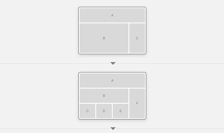
Thismanslife
Using simple layout wireframes, Thismanslife illustrates how a series of pages could work across these different devices, by simulating how the layout of each page would change responsively, to suit the context.
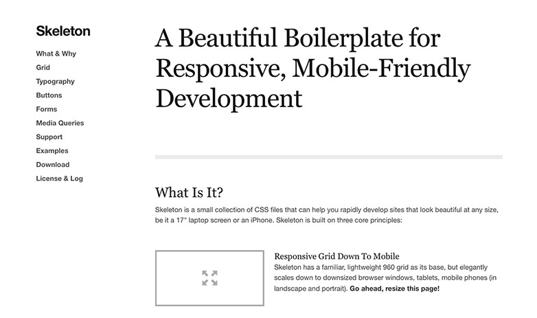
Skeleton
Skeleton is a small collection of CSS files that can help you rapidly develop sites that look beautiful at any size, be it a 17″ laptop screen or an iPhone.
Less
Less is a CSS grid system for designing adaptive websites. It contains 4 layouts and 3 sets of typography presets, all based on a single grid.
Gridless
Gridless is an optionated HTML5 and CSS3 boilerplate for making mobile first responsive, cross-browser websites with beautiful typography.
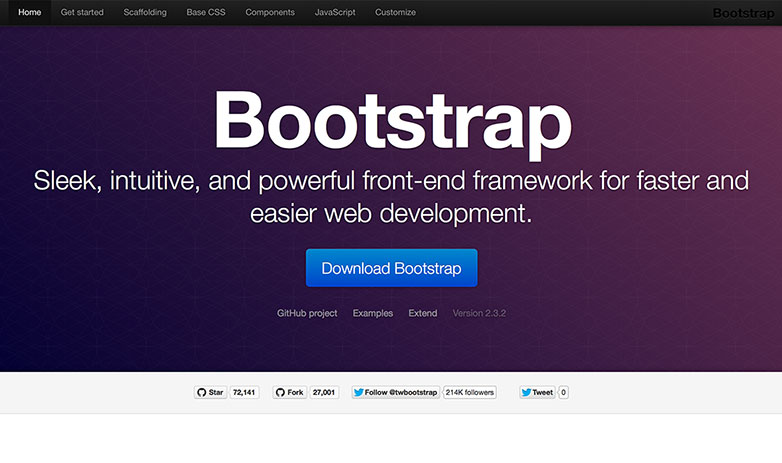
Bootstrap
Bootstrap is a sleek, intuitive, and powerful front-end framework for faster and easier web development.
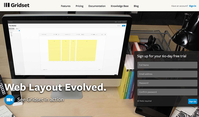
Gridset
Gridset provides fully custom grids for responsive layouts.
Susy
This is one of the best layout options on the web.
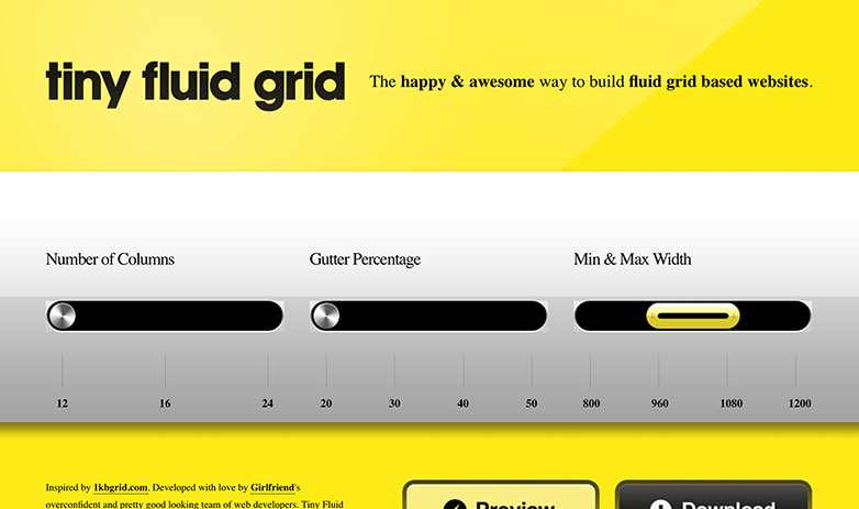
Tiny Fluid Grid
Tiny Fluid Grid ships with an index.html with demo code, and the grid.css containing the CSS for the grid you created.
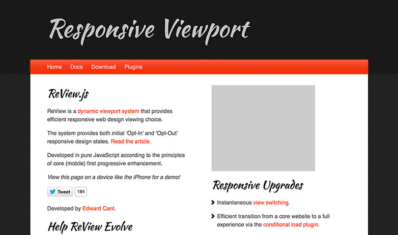
ReView
ReView is a dynamic viewport system that provides efficient responsive web design viewing choice. Developed in pure JavaScript according to mobile first priciples.
Responsinator
The Responsinator is designed to test responsive websites on different device resolutions.
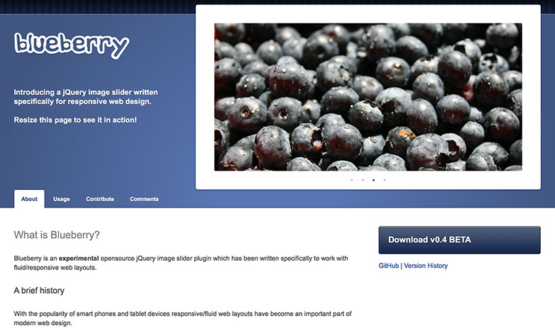
Blueberry
Blueberry is a jQuery image slider written specifically for responsive web design.
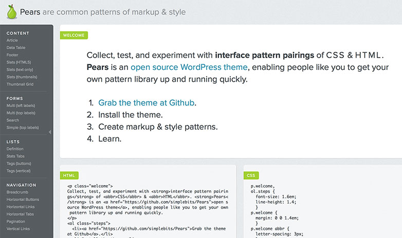
Pears
Pears is an open source WordPress theme, enabling people like you to get your own pattern library up and running quickly.
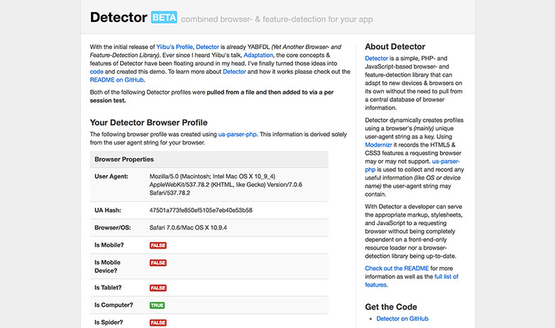
Detector
Detector is a simple, PHP and JavaScript-based browser and feature-detection library that can adapt to new devices & browsers on its own.
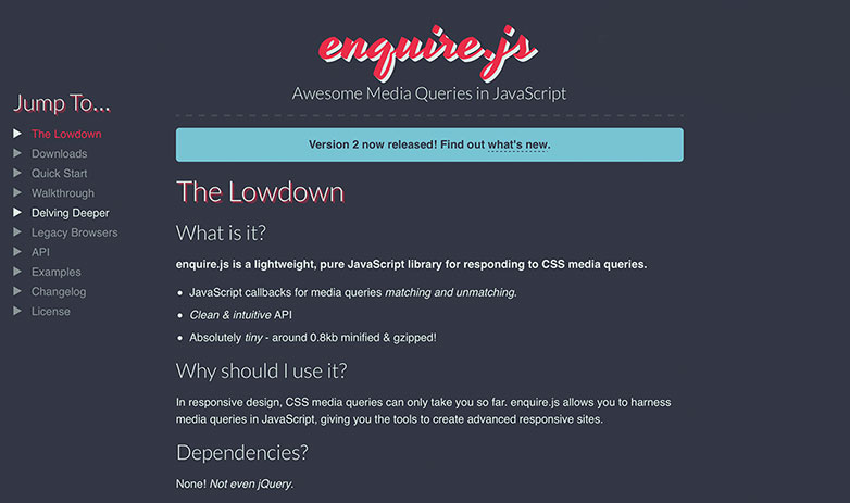
Enquire.js
Enquire.js is a lightweight, pure JavaScript library for responding to CSS media queries.
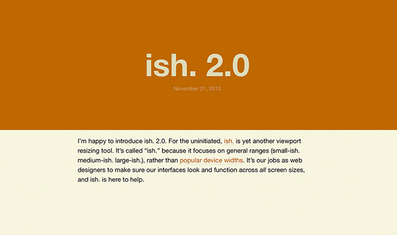
Ish
Ish is another viewport resizing tool. It’s called “ish.” because it focuses on general ranges (small-ish. medium-ish. large-ish.), rather than popular device widths.
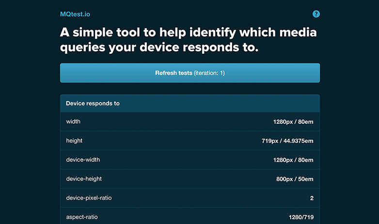
MQtest
MQtest is a simple tool to help identify which media queries your device responds to.
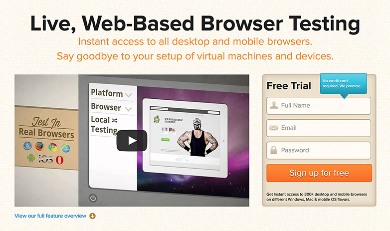
BrowserStack
BrowserStack lets you test your website for cross-browser compatibility on real browsers. Instant access to multiple desktop and mobile browsers.
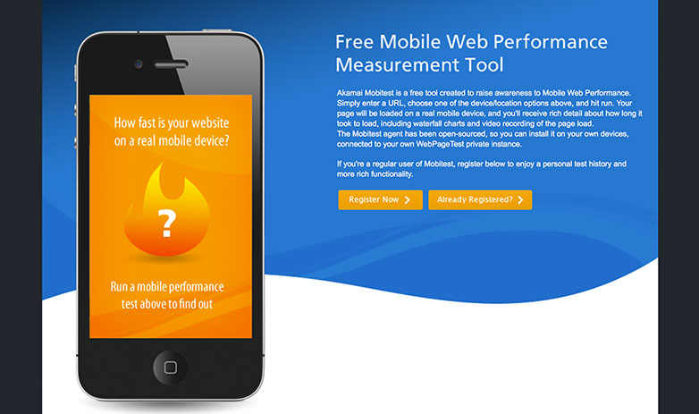
Mobitest
Mobitest is a free tool created to raise awareness to Mobile Web Performance.
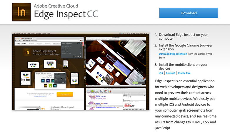
Edge Inspect CC
Edge Inspect is an essential application for web developers and designers who need to preview their content across multiple mobile devices.
Sass
Sass is the most mature, stable, and powerful professional grade CSS extension language in the world.
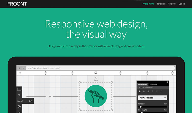
Froont
Froont designs websites directly in the browser with a simple drag and drop interface.
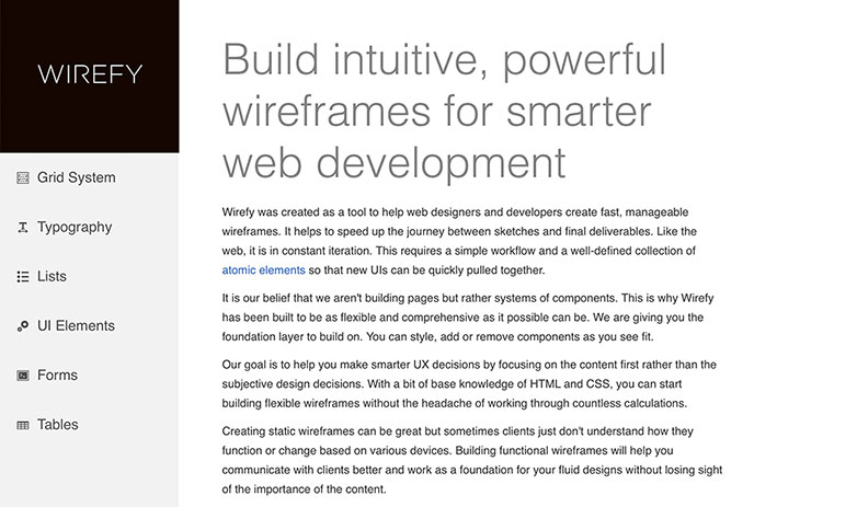
Wirefy
Wirefy helps you make smarter UX decisions by focusing on the content first rather than the subjective design decisions.
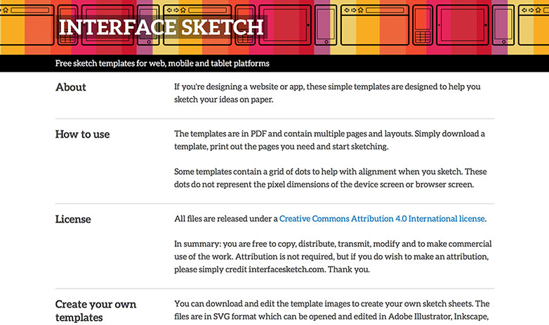
Interface Sketch
If you’re designing a website or app, these simple templates are designed to help you sketch your ideas on paper.
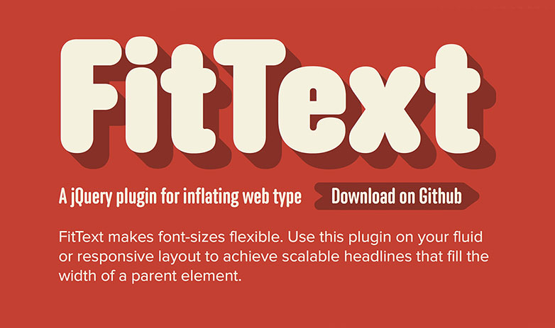
FitText
FitText makes font-sizes flexible. Use this plugin on your fluid or responsive layout to achieve scalable headlines that fill the width of a parent element.
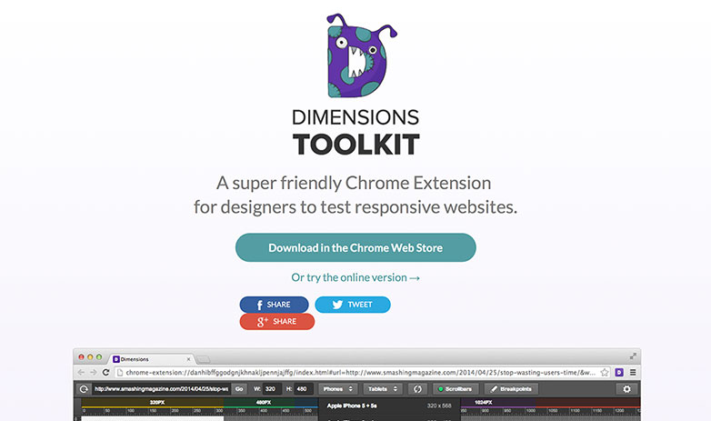
Dimensions Toolkit
This is a super friendly Chrome Extension for designers to test responsive websites.
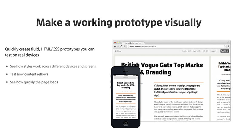
Responsive.is
Quickly create fluid, HTML/CSS prototypes you can test on real devices with this service.
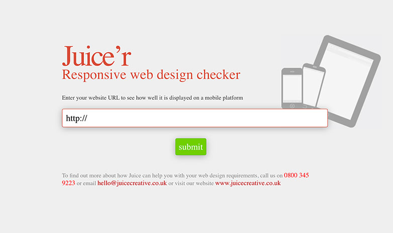
Juice’r
This is a responsive web design checker.
Sassaparilla
Sassaparilla is a fast way to start your responsive web design projects that harnesses the power of Sass and Compass.

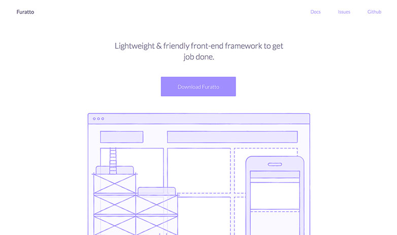
Furatto
This is a lightweight and friendly front-end framework to get the job done.
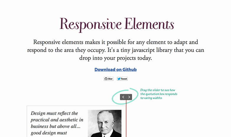
Responsive Elements
Responsive Elements makes it possible for any element to adapt and respond to the area they occupy.
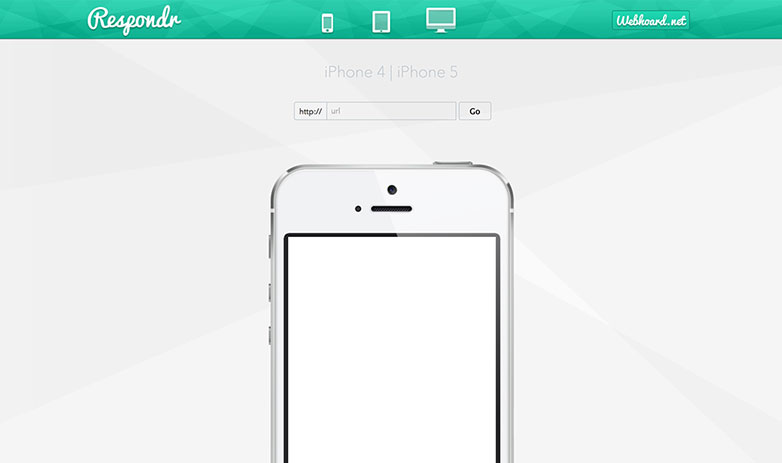
Respondr
Respondr is another responsive design test suite.
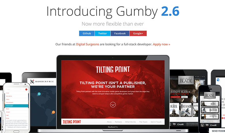
Gumby
Gumby is a flexible, responsive CSS framework.
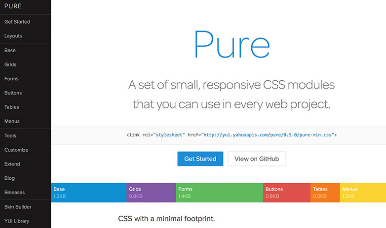
Pure
Pure is ridiculously tiny. The entire set of modules clock in at 4.4KB* minified and gzipped.
Tuktuk
The premise of Tuktuk to use as many features as possible of the latest CSS specification. The purpose is to encourage code reuse plus faster and more efficient stylesheets that are easier to add to and maintain.
Ivory
Ivory is a responsive front-end web framework that makes you front-end development faster and easier.
Kube
Kube is one of the world’s most flexible CSS frameworks. It gives you the full power of choice, creativity and beauty, while handling all of the technology behind it.
Font Awesome
Font Awesome gives you scalable vector icons that can instantly be customized — size, color, drop shadow, and anything that can be done with the power of CSS.
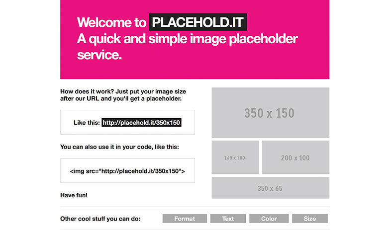
Placehold.it
Placehold.it is a quick and simple image placeholder service that will definitely speed up your development. You can also change things like format, text, color, & size all within your HTML document, while developing.