Almost every site you see these days has an image slider on the front page. They come in all sizes and depending on who you ask, they have limited benefit to a sites traffic or navigation compared to the amount of space they take up. But they look pretty and when used correctly can be fairly effective. This tutorial aims to create a simple WordPress page template with a slider that allows you to include a few posts that have been added to a slider category. To make it more interesting, we’re going to make it book-markable, use the absolute minimum of jQuery and add a simple CSS3 animation effect.
Creating a WordPress page template
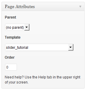
A WordPress template file is just like any other file in your theme except that it has an additional value in its comments. All this does is tell WordPress the name of the template, so that you can pick it from the Template drop-down (under Page Attributes). Here you can see I am calling my template slider_tutorial and adding it to the default Twenty_Twelve theme.
/**
 *
Template Name: slider_tutorial
 *
 * @package WordPress
 * @subpackage Twenty_Twelve
 * @since Twenty Twelve 1.0
 */
We also need to specify the page layout and The Loop, for this template we can keep it to the bare minimum
<?php
/**
 *
Template Name: slider_tutorial
 *
 * @package WordPress
 * @subpackage Twenty_Twelve
 * @since Twenty Twelve 1.0
 */

get_header(); ?>

    <div id="primary" class="site-content">
        <div id="content" role="main" class="clear-fix">
        <?php /* Start the Loop */ ?>
        <?php while ( have_posts() ) : the_post(); ?>
            <?php get_template_part( 'content', get_post_format() ); ?>
        <?php endwhile; ?>
        </div><!-- #content -->
    </div><!-- #primary -->

<?php get_sidebar(); ?>
<?php get_footer(); ?>
Populating the Slider
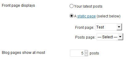
Now that we have a basic template, we can start to add our own logic. First up is our own The Loop. Here all want to do is specify the post_type as post and the category as slider. By doing it this way, we will automatically obey the WordPress Settings > Reading configuration value for “Blog pages to show at most”. We’re using the query_posts function here, so you have to remember to reset The Loop using wp_reset_query afterwards, otherwise the rest of the page will not render.
query_posts( array(
    'post_type' => 'post',
    'category' => 'slider'
));
Now that we have our own The Loop, we can iterate through it and render our slides. Each slide is going to have the featured image followed by the post tile and then the excerpt. This is very similar to a normal post layout, so you should be able to modify it to your own theme quite easily
<?php
query_posts( array(
    'post_type' => 'post',
    'category' => 'slider'
));
?>
<section class="slider-tutorial">
    <div>
    <?php if ( have_posts() ) { ?>

        <?php while ( have_posts() ) { the_post(); ?>

            <article id="post-<?php the_ID(); ?>" <?php post_class(); ?>>
                <?php the_post_thumbnail('full'); ?>
                <header class="entry-header">
                    <h1 class="entry-title">
                        <a href="<?php the_permalink(); ?>" title="<?php echo esc_attr( sprintf( __( 'Permalink to %s' ), the_title_attribute( 'echo=0' ) ) ); ?>" rel="bookmark"><?php the_title(); ?></a>
                    </h1>
                </header>

                <div class="entry-summary">
                    <?php the_excerpt(); ?>
                </div>
            </article>
        <?php } ?>

    <?php } ?>
    </div>
</section>
If your theme doesn’t support post thumbnails (featured image), you can add support for it by specifying the snippet below in your functions.php
add_theme_support( 'post-thumbnails' );
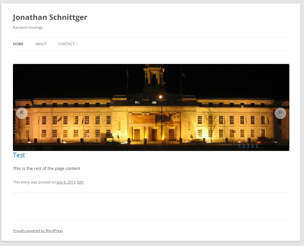
Controlling the slider – part 1
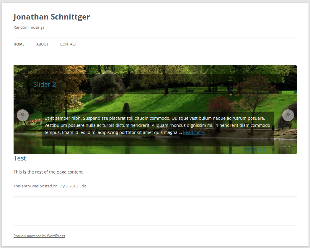
Normally sliders have 2 sets of controls, previous and next buttons and either numerical or icon based jump list. Creating these is pretty simple, all we need to do is at the end of our slides add in some placeholder divs and an ol element. Then inside The Loop we simply append to a html string ($nav) the li that will represent each slide. This means we don’t have to iterate through the loop (or anything else) again.
<?php
query_posts( array(
    'post_type' => 'post',
    'category' => 'slider'
));

<!-- Variables -->
$nav = '';
$counter = 1;


?>
<section class="slider-tutorial">
    <div>
    <?php if ( have_posts() ) { ?>

        <?php while ( have_posts() ) { the_post(); ?>

            <article id="post-<?php the_ID(); ?>" <?php post_class(); ?>>
                <?php the_post_thumbnail('full'); ?>

<!-- Inside Loop -->
                <?php $nav .= '<li><a href="#post-' . get_the_ID() . '">' . $counter . '</a></li>' ?>
                <?php $counter++; ?>


                <header class="entry-header">
                    <h1 class="entry-title">
                        <a href="<?php the_permalink(); ?>" title="<?php echo esc_attr( sprintf( __( 'Permalink to %s' ), the_title_attribute( 'echo=0' ) ) ); ?>" rel="bookmark"><?php the_title(); ?></a>
                    </h1>
                </header>

                <div class="entry-summary">
                    <?php the_excerpt(); ?>
                </div>
            </article>
        <?php } ?>

    <?php } ?>
    </div>

<!-- Navigation -->
    <div class="skip-to">
        <ol>
            <?php echo $nav; ?>
        </ol>
    </div>
    <div class="prev-button"><span>«</span></div>
    <div class="next-button"><span>»</span></div>


</section>
Styling the slider
Now that we have the basic structure for our slider done, we can start styling it. Instead of using jQuery or JavaScript to perform the animations, we’re going to use CSS3 transitions. Before we do that though, let’s style our navigation elements.
Styling the navigation
The first thing we need to do is make sure that our main section elements position is set to the relative state. We also want to hide any content that might exceed its size (especially since we will be positioning the slides off screen).
section.slider-tutorial {
    position: relative;
    width: 100%;
    overflow: hidden;
    border: 1px solid #000000;
}
Now we can absolutely position each of navigation controls where we want them to be. First we’ll position the skip/jump option to the bottom, right of the slider.
section.slider-tutorial div.skip-to {
    position: absolute;
    bottom: 0;
    right: 0;
    width: 20%;
}
Now we want to display the li elements inline, we do this using the float or display properties. We’re also going to specify a width and some margin between the items. WE should also make the a elements display as block and add some padding to make them easier to click on.
section.slider-tutorial div.skip-to li{
    float: left;
    display: inline-block;
    margin-left: 5px;
    width: 10px;
}

section.slider-tutorial div.skip-to li a{
    display: block;
    padding: 10px;
}
Here we are positioning the previous and next buttons to the left and right of the slider. Using the border-radius property we can also give them a rounded, circular look.
section.slider-tutorial div.prev-button {
    width: 40px;
    height: 40px;
    position: absolute;
    top: 50%;
    left: 10px;
    background-color: rgba(255, 255, 255, 0.5);
    -moz-border-radius: 25px;
    border-radius: 25px;
}

section.slider-tutorial div.prev-button span {
    display: block;
    margin: 0px auto;
    line-height: 90%;
    text-align: center;
    font-size: 30px;
}

section.slider-tutorial div.next-button {
    width: 40px;
    height: 40px;
    position: absolute;
    top: 50%;
    right: 10px;
    background-color: rgba(255, 255, 255, 0.5);
    -moz-border-radius: 25px;
    border-radius: 25px;
}

section.slider-tutorial div.next-button span {
    display: block;
    margin: 0px auto;
    line-height: 90%;
    text-align: center;
    font-size: 30px;
}
Styling the slides
We want to hide the slides so that only one is ever visible. To do this we can use absolute positioning again specifying values greater than 100%. I’m using percentages here so that the slider will scale better depending on how you use it. This doesn’t make it responsive, but it does make it more flexible. To make it responsive, you would use @media selectors to specify more accurate positions for your target resolutions.
Here we’re just resetting any padding or margins that may be applied by your theme
section.slider-tutorial article > img.attachment-post-thumbnail {
    padding: 0px !important;
    margin: 0px !important;
    border: 0px !important;
    max-width: 100%;
}
This is where we start specifying our CSS3 transitions. We first position the slide off screen (right: 200%) and then using the various browser *-transition properties specify the type of transition and its speed
section.slider-tutorial article {
    position: absolute;
    width: 100%;
    top: 0px;
    right: 200%;
    padding: 0px;
    border: 1px solid #000000;
    -webkit-transition: all 0.5s ease-in-out;
    -moz-transition: all 0.5s ease-in-out;
    -o-transition: all 0.5s ease-in-out;
    transition: all 0.5s ease-in-out;
}
Since I think it would look well for this, we’re going to have the title (header) of the post and the excerpt (div.entry-summary) text slide in at different speeds and from different directions. This gives the slider a more dynamic feel, similar to the parallax effect. To make the text more readable, I’m going to use a transparent background to give the text more contrast. This prevents the issue of trying to read white text on a light image.
section.slider-tutorial article header{
    position: absolute;
    top: 10%;
    left: -200%;
    width: 90%;
    -webkit-transition: all 1.0s ease-in-out;
    -moz-transition: all 1.0s ease-in-out;
    -o-transition: all 1.0s ease-in-out;
    transition: all 1.0s ease-in-out;
    background-color: rgba(0, 0, 0, 0.5);
    -moz-border-radius: 5px;
    border-radius: 5px;
}

section.slider-tutorial article header h1{
    padding: 20px;
}

section.slider-tutorial article div.entry-summary{
    position: absolute;
    bottom: 10%;
    left: 300%;
    width: 80%;
    padding: 10px;
    color: #ffffff;
    -webkit-transition: all 1.1s ease-in-out;
    -moz-transition: all 1.1s ease-in-out;
    -o-transition: all 1.1s ease-in-out;
    transition: all 1.1s ease-in-out;
    background-color: rgba(0, 0, 0, 0.5);
    -moz-border-radius: 5px;
    border-radius: 5px;
}
Here using the :target pseudo selector we are going to re-position our elements. The :target selector is triggered by the hash value of an url changing e.g. www.developerdive.com/index.php#slider-1. By setting the position, the transition is triggered and each element slides in to its new position at the specified speed.
section.slider-tutorial article:target{
    right: 0px;
}

section.slider-tutorial article:target header{
    left: 5%;
}

section.slider-tutorial article:target div.entry-summary{
    left: 10%;
}

section.slider-tutorial article:target footer{
    right: 10%;
}
Using a combination of the :hover and :target pseudo selectors, when the mouse hovers over the slider the transparent backgrounds will darken slightly to show some interaction
section.slider-tutorial:hover article:target header, section.slider-tutorial:hover article:target div.entry-summary, section.slider-tutorial article:target footer{
    background-color: rgba(0, 0, 0, 0.75);
}
Controlling the slider – part 2
As it stands it is now possible to change the slides using the jump/skip to list. This works because when we select the slide number we wish to see, we click on the a tag which sets the anchor value. This triggers our CSS selectors above. To navigate using the previous and next buttons we’ll have to add a little jQuery.
Using the jQuery ready function we can start to add our events. Before we do that we’re going to dynamically set the slider height. We’re also going to check and see if the current URL already has a hash value. If it does, we’ll try and match it with any of our slides and if we find one, we will skip straight to that slide.
<script type="text/javascript">
    jQuery('document').ready(function(){
        var slider = jQuery('section.slider-tutorial');
        var height = slider.find('article img:first').height();
        slider.height(height);

        var chosen = document.location.hash;

        if(chosen != ''){
            chosen = slider.find('div.skip-to ol li a[value="' + chosen + '"]')
            chosen = chosen.parent('li:first');
        }

        if( chosen.length == 0 )
            chosen = slider.find('div.skip-to ol li:first');

        chosen.addClass('chosen');
.......
.......
.......
Once that is done, we will add our click events to the previous and next buttons. Inside each function, we look for the currently chosen item, remove the chosen class and find the next item in the sequence. Then we simply grab the anchor name from the a tag and update the location hash value. This again triggers our CSS3 animation automatically.
.......
.......
.......
        slider.find('div.prev-button span').click(function(event){
            event.preventDefault();
            var prev = slider.find('div.skip-to ol li.chosen').removeClass('chosen').prev('li').addClass('chosen').children('a');
            if(prev.length > 0)
                next = slider.find('div.skip-to ol li:last').addClass('chosen').children('a');

            document.location.hash = prev.attr('href');
        });

        slider.find('div.next-button span').click(function(event){
            event.preventDefault();
            var next = slider.find('div.skip-to ol li.chosen').removeClass('chosen').next('li').addClass('chosen').children('a');
            if(next.length == 0)
                next = slider.find('div.skip-to ol li:first').addClass('chosen').children('a');
            document.location.hash = next.attr('href');
        });

        document.location.hash = chosen.children('a').attr('href');
    });
</script>
As always the full source is available to download, I’ve also added in some standard size images for you to play with. I got them from Google image search filtering by their usage rights. They’re all “free to use or share”.
Try adding some @media selectors to handle smaller sized screens, perhaps hiding the excerpt on smaller screens or hiding the slider all together might be an idea. A great tool for testing your site on different resolutions is the snappily titles Responsive Web Design Testing Tool by Matt Kersley. It shows you a preview of your site for the main screen sizes from your old smart phone to your iPad. It’s not perfect, and doesn’t cover the various browser intricacies out there but, it is still very useful
