Last week we discussed how important navigation is to a website and how developing an interactive navigation system will help give a clean, minimalist website a bit of character and make it feel modern and current.
It’s too easy to make a clean website look dated and as though it were developed in the 90’s, so by injecting modern user interfacing techniques that are popular today you’re able to put the viewer at ease and reassure them that the content is fresh and up to date.
We’ll pick up where we left off last time and begin by setting up the basic HTML for our page layout. Since we’re going to use a PHP include we’re going to have to save our homepage as index.php, rather than index.html.
While I’m at it, I’m going to include a logo image in my header and put my PHP include in to pull the navigation in to the homepage. For the logo I’m just using a basic version of Developer Drive’s logo, and I’ve simply named it “logo.jpg” and placed it inside a sub-directory named “images”.
You will also notice that I gave my <body> tag an id of “homePage”, we’ll explain why once we move on to our CSS file. My code looks as follows.
<!DOCTYPE html>
<html>
<head>
<title>Creating a clean website</title>
<link rel="stylesheet" href="mainStyle.css" type="text/css" media="screen" charset="utf-8"/>
</head>
<body id="homePage">
<header><img src="images/logo.jpg" alt="header" /></header>
<nav>
<?php include ('navigation.php') ?>
</nav>
</body>
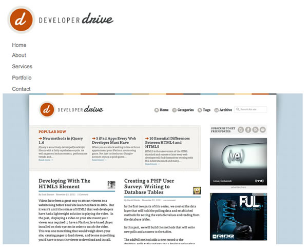
</html>Now that we’ve got our header and navigation in place, let’s add a <section> tag under our <nav> tag and drop a main image inside of it. My HTML now looks like this:
<!DOCTYPE html>
<html>

<head>
       <title>Creating a clean website</title>
       <link rel="stylesheet" href="mainStyle.css" type="text/css" media="screen" charset="utf-8"/>
</head>

<body id="homePage">
	<header><img src="images/logo.jpg" alt="header" /></header>

<nav>
	<?php include ('navigation.php') ?>
</nav>
<section>
	<img src="images/main.jpg" />
</section>

</body>

</html>
If you preview your work at this point you should have something similar to this.
If it’s any different, make sure that you’ve got the CSS file from the last tutorial attached to your index.php file. Speaking of that CSS file, let’s jump in there now and do some work. I started with a little trick to let the viewer know which page they’re on. Actually, we set this trick in motion when we were creating our HTML and gave our body tag an id. This following bit of code will give your navigation links an active state when the viewer is on that page. For example, if they are on the home page the text color will be as if the link were being hovered over.
body#homePage a#menu-home,
body#servicesPage a#menu-services,
body#portfolioPage a#menu-portfolio,
body#contactPage a#menu-contact {
	color:#C24E07;
}
Next I began styling our <nav> tag, giving it a width of 80px, a 15px margin-left and floated it left. You’ll also notice that I included block display, the reason for this is so that it’s guaranteed to work on older browsers that don’t fully support some of the new HTML5 tags. In time it won’t be necessary, but it’s easy enough to include.
nav {
	width:80px;
	margin-left:15px;
	float:left;
	display:block;
}
Now we’re going to want to style our <section> tag and move our main image up so that it aligns vertically with the top of our navigation and sits just to the right of it. To do this I set the <section> tag to float left and gave it a margin of 13px top and bottom and 11px on each side.
section {
	float:left;
	margin:13px 11px;
	display:block;
}
With the main image where I wanted it, I then went and added a little style to the image itself by rounding the corners and giving it a slight drop shadow. In order for the rounded corners to work on all major browsers we have to define it three times, once for Mozilla, once for IE, and once for Safari and Chrome.
section img {
	-moz-border-radius:7px;
	border-radius:7px;
	-webkit-border-radius:7px;
	box-shadow: 2px 2px 2px #838383;
}
To give a quick explanation of the box-shadow numbers, our shadow is going down 2px, right 2px, and fading over 2px starting with the given #838383 hexidecimal color code. It’s also worth noting that you can define specific corners to round, if you don’t want them all rounded off or if you’d like each corner to have a different radius. To do so you first define top or bottom, then left or right. For example if you only wanted the top left corner to be rounded you would want something like this.
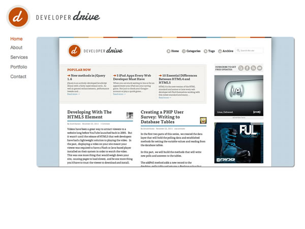
border-top-left-radius:7px;If you preview your work now you will see that it’s starting to come together and should look similar to this.
There’s a little more to add to this homepage to get it just the way I want it though, so be sure to check back next week when we’ll add some quick-info boxes just below our main image and utilize the new <article> HTML5 tag. While we’re at it we’ll put the new HTML5 <footer> tag to use as well. Along with rounding and drop shadowing our quick-info boxes we’ll also discuss gradients and an easy way of generating all the necessary CSS3 code to make them cross-browser compatible.