We’re going to wrap up our tutorial on how to develop a responsive website this week by making our secondary page, well, responsive.
We created our large layout for the page in our last tutorial, but now we want to make it fluid so that it will display nicely across various platforms, ranging from tablets and mobile devices to PC’s.
Let’s take a quick peak at what we’re working towards.
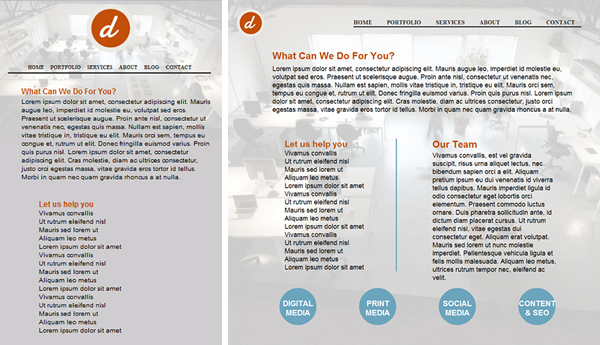
Notice how once we hit the skinnier, mobile version of the site we go to a more vertical layout. This makes it easier to read the text as it allows someone browsing the page from their touch-screen mobile device to navigate the page with one hand, as they can hold the device in their palm while vertically scrolling with their thumb.
The first order of business is to set some parameters for our main “services” id section under the landscape tablet media query. We want to use our medium sized image to cut down on load time. So, under the Tablet Layout: 768px @media only screen and (max-width: 1024px) and (orientation:landscape), I have added the following bit of CSS.
#services {
	background: url(images/servicesMed.jpg) no-repeat fixed;
	background-position:center;
	background-size: cover;
	-webkit-background-size: cover;
	-moz-background-size: cover;
	-o-background-size: cover;
}
Once we have shrunk our background image down a bit we’re going to want to do the same with our services bubbles, and all of the content within the bubbles. You’ll notice that I also changed the margins up a bit to accommodate the smaller sized circles.
.servCats {
	width:100px;
	height:100px;
	margin-left:12%;
}

	.servCats p {
	width:100px;
	text-align:center;
	margin-top:30px;
}

	.servCats a {
	font-size:1.2em;
}
That does it for the landscape tablet view, so now let’s scroll down a little further in our main.css file and tweak the portrait view. This will be the exact same code as above.
#services {
	background: url(images/servicesMed.jpg) no-repeat fixed;
	background-position:center;
	background-size: cover;
	-webkit-background-size: cover;
	-moz-background-size: cover;
	-o-background-size: cover;
}
	.servCats {
	width:100px;
	height:100px;
	margin-left:12%;
}

	.servCats p {
	width:100px;
	text-align:center;
	margin-top:30px;
}

	.servCats a {
	font-size:1.2em;
}
Last up on the docket is our mobile media query. What we’re going to do here is take our two “servColumn” elements and display them one on top of the other, instead of side-by-side like they are in the larger formats of our design.
Displaying these elements vertically like this will make the content much easier to read on mobile device. To maintain the same appearance as we did in our larger design we would have had to shrink the text so small that it was unreadable, or if we maintained a reasonable size font we would have averaged a word or two per line.
First things first, go ahead and define the small image for the mobile query.
#services {
	background: url(images/servicesSmall.jpg) no-repeat fixed;
	background-position:top;
	background-color:#CFCDCF;
	background-size:contain;
}
Once you’ve done that let’s go ahead and shrink the size of some of the text and header text across our page.
.whatWeDo h4 {
	font-size:1.2em;
}
#servPageContent {
	font-size:.6em;
}
Next up we’ll define the height we need our main content area to be in order to keep it from spilling over in to our footer.
.servContent {
	min-height:1200px;
	max-height:1300px;
}
Then we’re going to adjust our servColumns to stack on top of each other and display a little better on a mobile device. You’ll also notice we shrunk the font size for these headers so that they’d match our other header.
.servColumns {
	float:left;
	width:80%;
	margin-left:10%;
	margin-bottom:5%;
}

.servColumns ul li {
	list-style:none;
	border-right:none;
}
.servColumns h4 {
	font-size:1.2em;
}
Our last order of business is to position our bubbles. As far as the actual circles and contents therein go, it’s the same as we already defined above. The only addition is our “bubble34” class, which will help add a little extra style when someone views the page in portrait view from their mobile device by shifting the bottom two bubbles to the right.
.servCats {
	width:100px;
	height:100px;
	margin:0 0 8% 3%;
}

.servCats p {
	width:100px;
	text-align:center;
	margin-top:30px;
}

.servCats a {
	font-size:1.8em;
}
.bubbles34 {
	width:250px;
	float:right;
}
That does it. Save your work and check it to see how you did. Now see if you can create the rest of the pages for this site and make them degrade fluidly over the various resolutions that we’ve lined out.
You can download the source code for this tutorial by clicking here.