These days recycling is all the rage, and one of the more interesting things to note is you can recycle just about anything. In this article, I’m going to introduce you to a new kind of recycling: the Frankensite!
“What the heck is a Frankensite?” you ask. A Frankensite, as the name implies, is a kind of monster. You make an entirely new website from the decomposed remains of other websites, selecting only the choicest parts. Now take note, because this is very important… I am not talking about plagiarism. That’s never OK. Everything you create needs to be completely original or properly attributed to the source, making sure to comply with the terms of any applicable licensing.
You can—and should—draw inspiration from any site with measurable success, or even just one with attributes you think are really cool. Rather than copying directly, think about ways you could innovate to make those features even better. Perhaps the most frustrating things about the world of web development is that innovation tends to happen in very slow hops rather than the smooth steady progression that it should be. So we end up with one smart innovator sets a trend, and then suddenly every website looks the same. Nobody should really want that.
The theory of a Frankensite is that because it brings together all the best elements of several different unrelated sites, the final result should be a perfect site. But as Dr Frankenstein discovered, what works in theory doesn’t always work so well in practice. How you go about it will make a big difference to the outcome. Let’s take a look at the sorts of things you might consider when building your Frankensite.
Navigation
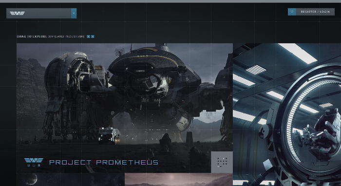
Navigation is such a fundamental part of the UX that how well it’s done can make a huge difference between whether a site thrives or merely survives. One of the best site navigation examples I’ve seen is used on the Weyland Industries website (the whole website is actually very cool in terms of design, but we should expect that, since it was created about 40 years in the future).
Attention-grabbing “Hero” section
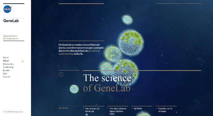
Most websites these days use those enormous hero images to grab users by the eyeballs and force them to look at the page. I’m not a big fan of these things, but it looks like they’re here to stay because designers have become addicted to the look. The best example I’ve seen for this is from the About page of NASA’s Gene Lab. Try not to die of envy if you go to look.
Innovative content styling
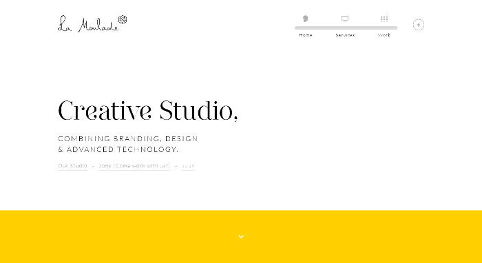
How you actually lay out your content depends a lot on what kind of site you’re making and who the audience is. One example of an interesting twist on basic content layout can be found at La Moulade. You may need to scroll down a little before you see what it’s all about, but it’s worth the effort.
Great error handling
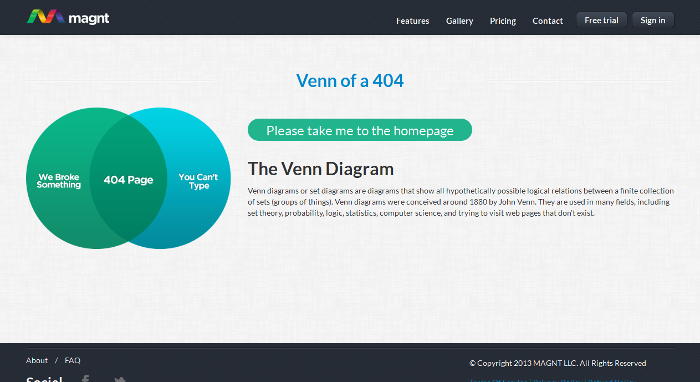
Who doesn’t love a well-designed 404 page? Sometimes the best part of a site is the part that hardly anyone ever sees. There’s a great example of how to do it properly at Magnt.
Once you’ve found your own inspirations, the idea is to combine the ideas into a single functional Frankensite. Making it work depends totally on your skill.