There are a few font’s that I almost alway find myself using when it comes to WordPress themes, graphics or marketing materials. I tend to use them because they are clean, flexible, easy to read and alway enhance the end result. In no particular order they are:
- Open Sans
- Archive
- Bariol
- Blanch
- Nexa
- Print Clearly
- Manteka
Open Sans
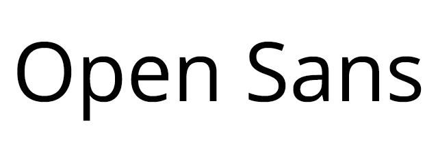
Open Sans is a great font, it looks great in pretty much all media formats and comes in a range of different weights. I tend use it primarily for large blocks of text rather than headings, but it works just as well for them too. Open Sans was actually commissioned by Google a few years ago, and it’s the font the primarily use. You can incorporate it in your own site using either Google Web Fonts or download the full Webkit from Font Squirrel
Archive
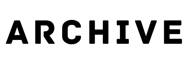
Archive is a strong, capitalized font. It’s got quite a bold shape to it, but still manages not to be over-imposing. Designed by Slava Kirilenko it looks great on posters or against busy backgrounds. I tend to use a narrow character spacing to really emphasize the text. You can actually download it for free from Font Fabric
Bariol
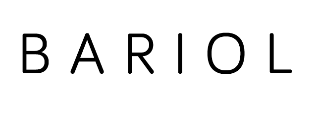
Bariol is an excellent font for titles and single words. It’s a very clean and elegant font that I tend to use with a larger than normal character spacing. Bariol isn’t a free font, but you can actually pay for the regular or italic font with a tweet or you can choose the price you want to pay for the full set. The options range from between €3 – €50 for either the plain or italicized sets.
Blanch
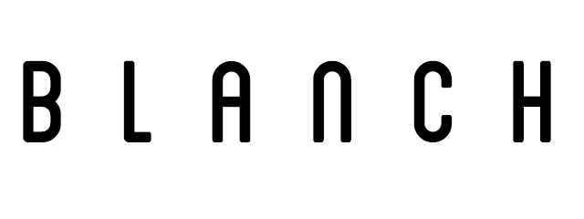
Blanch is another great title font, it’s got a kind of vintage feel to it. It was actually done for a Spanish fruit company called Fruita Blanch by a design house called Atipus. You can get it for free from David Ariey
Nexa
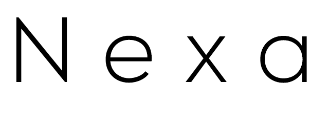
This is actually one of my favorite fonts to use. It was designed by Svetoslav Simov and it looks great in blank on white, and is very sharp. It works well as both a header/title font and as a main font for larger text blocks. It’s clear and easy to read. Font Fabric have the light and bold variations available for free here, you can also by the full set from My Fonts for $90. I’ve never bothered as I think the light is the best variant, but your mileage may vary.
Print Clearly
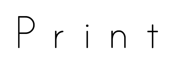
This one is by Blue Vinyl Fonts and is freely available. It’s simple and is quite subtle, so I do use it sparingly, mostly I use it for quotations or smaller blocks of text. It actually reminds me of the font used in primary school books.
Manteka
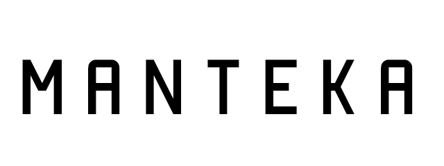
Manteka seems to be everywhere these days, I’ve seen it on everything from t-shirts to posters. It’s a bit of a mix between sharp edges and rounded corners that works well in larger fonts. I have started to use this less as it is so common these days, but that is because it’s a great font. It was designed by Eduardo Araya and is also freely available
Using these fonts
All of these fonts are available for free or almost free and are very flexible in their uses. If you’re going to use them, make sure your play with the kerning (character spacing) as it can really effect the look and feel. If you’re using CSS, you can do this using the letter-spacing word-spacing properties. I would also suggest you make sure you specify a suitable line-height so different lines don’t run in to each other.